Kube, our PIM-Client in the making, is supposed to run on a variety of platforms and form-factors. We aim to provide a consistent look and feel across them all. If you know how to use Kube on your desktop machine, you will know how to use it on your Android phone or tablet as well. So what we are going to do, is building a UI for the phone, allowing it to display multiple pages on the tablet and in the end serving it on the desktop as well. Good idea, right?
Not quite. While consistency is our goal, we don’t believe in “one UI to rule them all”, at least not in the sense of just getting an enlarged version of your tablet app as a desktop application. Instead, what you will get with Kube is a specifically optimized user interface for each form-factor you are running it on. Thanks to QtQuick, the only difference will be “a little” UI code, the core will stay the same.
To achieve our UI goals, we are employing Kirigami UI. It offers us:
1) A set of UI Components that seamlessly integrate with QtQuick Controls to build a pretty UIs for Kube.
2) but more importantly: UI/UX patterns, that make the UI not only pretty but usable and bring us closer to our goal of convergence, despite beeng specially tailored for the form-factor.
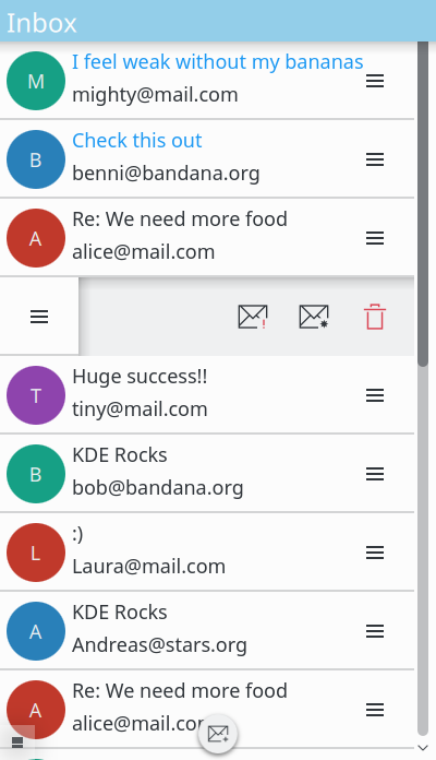
No good blogpost without a picture. So here it is: A first look at Kube on mobile, build with Kirigami.

For an intermediate state it look promising. Thanks for the update. I miss threaded conversations, any structure (e.g. accounts, smart folders etc.) with the option to search or filter, quick preview of the mail content, integration of other modules (calendar, address book), and much more. I also worry about placing reply features (cannot guess from the small decorators, i.e. exclamation mark, and fav star, what function is underlying) next to delete (trash bin). And a smaller FAB button compared to the items gives the wrong visual cue, IMHO.
All valid points. Let me try to address them:
Threaded conversations are in the making.
Currently folder/smartfolder navigation and search are in the global side drawer on the right. We probably want to put the folders in the page row navigation though.
Integration with modules will likely be implemented as a “share” feature accessible through the right (context) side drawer.
Reply will be available once you click on the mail and get to the mail view.
The quick(swipe) actions are “mark unread” / “mark important” / “delete mail”. We are likely going to make them configurable in the long run.
The FAB button will have the normal size, once it is on a phone.
Awesome stuff 😉
Looks really nice. The only problem I see is padding on the right side of the icon – I think it should be a bit bigger.
Thanks.
I have yet to go over this with someone form the VDG to make it pixel perfect.
As I told you I’m not a big fan of this useless (M) (B) (A) circles which are by the way to big. It doesn’t say anything but you focus the UI to the circles.
Use different colors for how often you get mails, is it important, if there is an avatar use the avatar with an cirle with the important color, use the circles for show usefull informations.
We have plans for the Avatar area that go beyond big colored circles. Take a look at https://phabricator.kde.org/M22 for more information.